A week has gone by without me posting a single post. So much for blogging three times a week.
I started a post about how Week 2 without sugar went, but then it got long-winded and started to get into arguments with myself about what I was doing. So all I'll say is the experiment is continuing and if I get through today, I'll have been three weeks without sugary treats or (as far as I can control) added sugar in anything.
Juniordwarf returned to school. It wasn't the big emotional event it was for me in 2011 and last year. In fact the holidays flew by so quickly, the return to school almost caught me by surprise. I didn't really have time to think about it, or even do anything to mark it. I took a couple of photos of Juniordwarf in his classroom and that was about it.
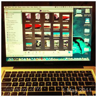
I did some work on my Project Life album.
As a temporary fix, I moved my November and December 2012 pages that were overflowing from last year's album into a new album, where I've also set up my 2013 pages.
I'm still debating whether to keep doing Project Life in the hybrid way I did it last year, putting the physical photos into an album as I do them, or whether to load everything into a digital photo book and print it once. The main obstacle to doing that is deciding what to do with all the chunky memorabilia that's difficult to scan. It would also mean that I didn't have a physical book until next year some time.
So what are this year's pages looking like?
I'm glad you asked.
This year I'm not using any of the core kits. I'm using various digital papers to create background cards for the photos, journal cards and title cards.
I'm sticking to two fonts - one for titles and the other for journalling - and will mainly be journalling in black or white text. I'm also going to try journalling directly onto my photos, so that I can free up the journal card slots for more photos.
I did that a bit last year, but I plan to do it a lot more this year as I think it looks great. I was inspired by some of the lovely pages from Windy Willow, who is creating some gorgeous spreads.
So this is what one of my pages might look like when I print out the photos and slot them into the page protectors. It's basically six 6x4 pictures, with the middle row able to be cut into the 2.9x4 size that slots into the smaller pockets. (Yes, I forgot about the slightly smaller width for those "cards" when I was putting this together, so the gaps aren't very even. But this is just a mock-up to show the general idea.)
Because I'm doing a monthly approach, rather than weekly spreads, I don't have title cards for pages where the photos are just random things that happened. Only the spreads where all the photos are of the same subject will have their own title card.
As you can see, some of the 6x4 "cards" have journalling and photos, and some are just photos. I have a 3x4 picture on one 3x4 "card" and the rest of them are devoted to journalling. (I had quite a lot of journalling on this page.)
So that's how it's looking at the moment. I'll be able to see what I think of it when I've printed the photos and put them in the album.
I've kept it simple, with no embellishments at this stage because I know if I started looking for the "perfect" embellishments I'd take forever, and never get these photos done. And getting them done is my main objective. So the "added extras" aren't being added. I might look into this a bit later in the year if I get time.
This year I'll be linking up with Nightwolf's Den for my Project Life posts, so I'm looking forward to seeing a lot of inspiration over there.
Now it's on to February.
Showing posts with label photo editing. Show all posts
Sunday, February 10, 2013
Thursday, January 24, 2013
project life 2012 - the home stretch
I really wanted to get the rest of the 2012 photos edited and printed for my Project Life album by the end of January, so I kept going with it this week. Since my last post I have:
Finished the October 3x4 journal cards.
Printed some more title and 'month in review' cards.
Edited and printed all the remaining 2012 photos.
Started thinking about my 2013 album.
And realised that this album is not going to be big enough to hold the whole year's photos.
(This is up to August.)
So I've got too much for one album, but not enough for two.
While I'm dealing with that problem, I also have piles of photos from the last four months and a whole week off work to gradually sort them out and put them into page protectors.
And then I can get started on the journalling. And the January 2013 photos.
I wonder if Photo-free February could become a thing?
Tuesday, January 15, 2013
sorting photos
After an epic photo editing weekend, I had over 150 photos to print on Monday morning for my August and September Project Life layouts. (I might add here that September was a huge photo month, with Juniordwarf's birthday, his party and our holiday to the East Coast, so there were a lot of photos to go through. I think I did well to cut them back as much as I did!)
I'm really not good at culling photos or picking one or two to capture an event. So where other people might be doing weekly layouts and choosing the best photo (or two) to put in their album, I end up with an entire page.
Case in point:
I love these Design C page protectors because I can just slot in six 6x4 pictures (or in this case, five and a title card), no cutting or resizing required. Not even any journalling, although I could have replaced one of the pictures with a 6x4 journal card. What I might do is tack a card to the back of one of the pictures, do the journalling and put a tab on the top so that it can easily be pulled out.
(I hear some of my scrapbooking friends laughing hysterically as I mention journalling.)
I also find it very difficult to reduce the number of photos I take (thereby increasing the sorting task) because, even though I already have heaps of photos of a particular thing (Juniordwarf asleep comes to mind), there is always a slightly different angle, a new expression, something that catches my eye that I just have to have a photo of . . . and so I do.
I'm trying to cut back, but I've always been a prolific taker of photos, and once I got a digital camera, there really were no limits. The challenge for me is to try and take fewer photos, but better photos, and to let go of the ones that don't contribute to the story.
I suspect this will take a while to achieve.
I'm really not good at culling photos or picking one or two to capture an event. So where other people might be doing weekly layouts and choosing the best photo (or two) to put in their album, I end up with an entire page.
Case in point:
(I hear some of my scrapbooking friends laughing hysterically as I mention journalling.)
I also find it very difficult to reduce the number of photos I take (thereby increasing the sorting task) because, even though I already have heaps of photos of a particular thing (Juniordwarf asleep comes to mind), there is always a slightly different angle, a new expression, something that catches my eye that I just have to have a photo of . . . and so I do.
I'm trying to cut back, but I've always been a prolific taker of photos, and once I got a digital camera, there really were no limits. The challenge for me is to try and take fewer photos, but better photos, and to let go of the ones that don't contribute to the story.
I suspect this will take a while to achieve.
Wednesday, January 2, 2013
organising project life
In my last post I said that I was several months behind in my Project Life album for 2012. I tried to keep up, but once I got a little bit behind it became easier and easier not to do anything, and the photos built up and up.
If I was less of a perfectionist, I'd probably say something like, "stuff it, I'm just going to grab a few of the most memorable photos from each month and make a couple of spreads for each month and be done with it in a day or two".
Alas, I am not that person. I feel like my album is half full with the style I went with at the start of the year (note I never got around to posting Part 2 of that post . . .) so it would look weird to suddenly do a truncated version for the rest of the year.
So I've made a start at sorting, organising and editing the rest of my photos from July to December.
It's become a four-stage process.
I met a fellow Aussie Project Lifer, @Kelmscott_Girl, on Twitter a few days ago, and her post on catching up had some great ideas about keeping your photos under control. I also recently discovered that I can create folders in iPhoto (on my Mac), which has made the sorting process a lot easier. (Yeah, I know, I've been using Macs most of my life and I didn't know about folders . . . )
So, on to what I've been doing.
Stage 1 is simply sorting out which photos I might want to use. I create a smart album in iPhoto for all the photos I took in the month. Then I made a copy of that album as a normal album, so I can delete the photos as I transfer them into their subject album (this is probably not necessary, but you can't delete photos out of a smart album and I like to be able to see which photos I've allocated and which ones I haven't used).
I create standard albums for each month:
I make a folder for the month and put all these albums in it to keep the side bar tidy and so I don't get lost.
Stage 2 is to decide which photos I will actually use, and which page protector design will work with them. Here is where I'll work out the structure of the month, because the design I choose for one set of photos will, to some degree, determine which photos I can use on the next page. For example, I can't follow a right hand Design A page (the 6x4 landscapes) with a page of portrait-oriented photos on the left on the next spread.
I write this all down with basic page designs so I know where to put the photos when I get them printed. Then I export the photos into equivalent folders into my Project Life folder ready to edit.
Stage 3 is editing in Photoshop Elements. This could be simply tweaking the levels or cropping and resizing, or it could be creating photo montages, or making hybrid journal cards like this one (from the Little Photos album).
A word about the hybrid journal cards. They seemed like a great idea when I started doing them, but they take more time than I thought they would. I'm not totally sure whether it's any easier than cutting out the photo and hand writing the card. But I kind of committed to the style this year, so I want to stick with it to the end. It also means I have A LOT of my Project Life kit left because I've done so much work with the digital kit.
The final stage is to print the photos and put them into the physical album, filling in any journalling cards that I haven't already done on the computer. This is where I tend to procrastinate, as I'm not good at journalling. I use a date stamper for the dates, as this came with the original Project Life kit in 2010, but I've decided to stop using it after this year. It's easier to hand write the dates.
After all that, as of today, I've got July ready for printing, I've sorted and organised August and September and I've culled October, November and half of December.
My approach isn't as simple as I'd like it to be, so I'm hoping to streamline it in 2013. Also I don't intend to get six months behind again, so I won't need to be doing six months at once!
If I was less of a perfectionist, I'd probably say something like, "stuff it, I'm just going to grab a few of the most memorable photos from each month and make a couple of spreads for each month and be done with it in a day or two".
Alas, I am not that person. I feel like my album is half full with the style I went with at the start of the year (note I never got around to posting Part 2 of that post . . .) so it would look weird to suddenly do a truncated version for the rest of the year.
So I've made a start at sorting, organising and editing the rest of my photos from July to December.
It's become a four-stage process.
I met a fellow Aussie Project Lifer, @Kelmscott_Girl, on Twitter a few days ago, and her post on catching up had some great ideas about keeping your photos under control. I also recently discovered that I can create folders in iPhoto (on my Mac), which has made the sorting process a lot easier. (Yeah, I know, I've been using Macs most of my life and I didn't know about folders . . . )
So, on to what I've been doing.
Stage 1 is simply sorting out which photos I might want to use. I create a smart album in iPhoto for all the photos I took in the month. Then I made a copy of that album as a normal album, so I can delete the photos as I transfer them into their subject album (this is probably not necessary, but you can't delete photos out of a smart album and I like to be able to see which photos I've allocated and which ones I haven't used).
I create standard albums for each month:
- Little photos (for the Design F summary page - like the card below)
- Random photos (with one or two photos per event)
- Photos of the boy doing random stuff (same)
I make a folder for the month and put all these albums in it to keep the side bar tidy and so I don't get lost.
Stage 2 is to decide which photos I will actually use, and which page protector design will work with them. Here is where I'll work out the structure of the month, because the design I choose for one set of photos will, to some degree, determine which photos I can use on the next page. For example, I can't follow a right hand Design A page (the 6x4 landscapes) with a page of portrait-oriented photos on the left on the next spread.
I write this all down with basic page designs so I know where to put the photos when I get them printed. Then I export the photos into equivalent folders into my Project Life folder ready to edit.
Stage 3 is editing in Photoshop Elements. This could be simply tweaking the levels or cropping and resizing, or it could be creating photo montages, or making hybrid journal cards like this one (from the Little Photos album).
A word about the hybrid journal cards. They seemed like a great idea when I started doing them, but they take more time than I thought they would. I'm not totally sure whether it's any easier than cutting out the photo and hand writing the card. But I kind of committed to the style this year, so I want to stick with it to the end. It also means I have A LOT of my Project Life kit left because I've done so much work with the digital kit.
The final stage is to print the photos and put them into the physical album, filling in any journalling cards that I haven't already done on the computer. This is where I tend to procrastinate, as I'm not good at journalling. I use a date stamper for the dates, as this came with the original Project Life kit in 2010, but I've decided to stop using it after this year. It's easier to hand write the dates.
After all that, as of today, I've got July ready for printing, I've sorted and organised August and September and I've culled October, November and half of December.
My approach isn't as simple as I'd like it to be, so I'm hoping to streamline it in 2013. Also I don't intend to get six months behind again, so I won't need to be doing six months at once!
Sunday, July 15, 2012
healthy heart challenge - week 6
This was the last day of the Heart Foundation's Healthy Heart Challenge, which I started six weeks ago.
You can see my results here.
I'm pleased with what I've done over the last six weeks. Apart from two days last weekend when I was feeling extremely miserable and stressed (which is probably the time I needed to exercise the most), and one day when I fell five minutes short of my target, I met the goals that I'd set. That's 39.83 out of 42 days. I think that's a pass.
I've also lost close to 7 kg since February.
I didn't set any huge life-changing exercise goals. The point for me was to try and establish some habits that I can carry forward. I think I've done that, and I intend to keep going on the path I'm on. I'm comfortable with it, it's something I know I can do within my current commitments, and it's working for me.
This makes me happy.
Saturday, February 25, 2012
Project Life - January - Part 1
My 2012 Project Life album is coming together quite well. This year I've stuck with my approach of working month by month, rather than using the "Photo a Day" approach, or doing a spread for each week. These are popular ways to use Project Life, but they don't really work for me.
What I do is make several pages of random things that I've taken photos of throughout the month - so usually some pages of Juniordwarf doing his stuff, one or two 'random' pages and then layouts that cover an event or a place that we went to - either a double spread or singe page, depending on how many photos I took.
At the end of last year I started adding in different sized page protectors so I could include things that are bigger than photos in the album as well. Mostly these are A4 and A5 sheet protectors.
For the first page each month I'm using the new Design F page protectors to include some small photos of random things, places and events that I might not otherwise have included. Most of these are from my Instagram photos that I have resized to 2" x 2".
Instead of using the physical journal cards, I purchased the digital collection from Jessica Sprague. I simply add the photo to the card in Photoshop Elements, include any of the extra elements that I want (usually just the day sticker), and type in my journalling. I wanted to use the same fonts that are used in the Cobalt collection, but couldn't find out what they are. The closest I found for plain text was American Typewriter, which I really like.
Once I'm happy with the psd files I open up a new 6x4 blank file, paste in two of the 3x4 journal cards and then print them as a normal 6x4 photo.
For each month's title card, I'm using one of the digital 6x4 cards and typing in the title and again printing it as a 6x4 photo.
The reverse of the title is one of the digital bi-fold journal cards that I've resized to 6x4 (the bifold cards are slightly narrower than 6" so they can fit into the 3x4 slots). I've then typed in the "month in review", included the digital numbers to represent the dates of the most significant things we did during the month and then hand-written some journalling about those events directly onto the photo.
Then for the rest of the month, I continue the same approach I used last year.
Pages 3 and 4 are a combination of digital and paper. Page 3 includes a lot more journalling than photos. I wanted to include the baked beans recipe and the story behind cooking them. This was another one where I used one of the resized bifold journal cards and added pictures and journalling.
I love the new page protector designs, as they provide a lot more flexibility in terms of the photo sizes and orientations that I can include. Design D, with four portrait 6x4 photos and four horizontal 3x4 journal spots is one I think I'll use a lot.
For the journalling in pages 5 and 6 I used the 3x4 cards and turned them sideways. There are a few designs that have the grid pattern rather than ruled lines, so can be used either way.
I'm also mixing up whether the photos have white borders or no borders because I think it breaks the pages up nicely.
Where I include more than one photo on a 6x4 picture, as in page 7 (above) sometimes I will break the photos up (bottom left) and sometimes I'll keep them all together (top right).
Page 9 is an example of Design B, which I like because I can use one 6x4 portrait and one 3x4 landscape photo plus a journalling card to tell the story. I used it quite a bit last year and I'm glad it's included again this year.
So that's it for Part 1 of January, and my new approach to Project Life. Part 2 will show some layouts that cover specific events, rather than random photos over the course of the month.
Do you use Project Life? What approach are you using?
What I do is make several pages of random things that I've taken photos of throughout the month - so usually some pages of Juniordwarf doing his stuff, one or two 'random' pages and then layouts that cover an event or a place that we went to - either a double spread or singe page, depending on how many photos I took.
At the end of last year I started adding in different sized page protectors so I could include things that are bigger than photos in the album as well. Mostly these are A4 and A5 sheet protectors.
For the first page each month I'm using the new Design F page protectors to include some small photos of random things, places and events that I might not otherwise have included. Most of these are from my Instagram photos that I have resized to 2" x 2".
![]() |
January title page (R) |
Instead of using the physical journal cards, I purchased the digital collection from Jessica Sprague. I simply add the photo to the card in Photoshop Elements, include any of the extra elements that I want (usually just the day sticker), and type in my journalling. I wanted to use the same fonts that are used in the Cobalt collection, but couldn't find out what they are. The closest I found for plain text was American Typewriter, which I really like.
Once I'm happy with the psd files I open up a new 6x4 blank file, paste in two of the 3x4 journal cards and then print them as a normal 6x4 photo.
For each month's title card, I'm using one of the digital 6x4 cards and typing in the title and again printing it as a 6x4 photo.
The reverse of the title is one of the digital bi-fold journal cards that I've resized to 6x4 (the bifold cards are slightly narrower than 6" so they can fit into the 3x4 slots). I've then typed in the "month in review", included the digital numbers to represent the dates of the most significant things we did during the month and then hand-written some journalling about those events directly onto the photo.
![]() |
Reverse of January title page (L) |
Then for the rest of the month, I continue the same approach I used last year.
![]() |
January page 3 (R) |
Pages 3 and 4 are a combination of digital and paper. Page 3 includes a lot more journalling than photos. I wanted to include the baked beans recipe and the story behind cooking them. This was another one where I used one of the resized bifold journal cards and added pictures and journalling.
![]() |
January page 4 (L) |
I love the new page protector designs, as they provide a lot more flexibility in terms of the photo sizes and orientations that I can include. Design D, with four portrait 6x4 photos and four horizontal 3x4 journal spots is one I think I'll use a lot.
![]() |
January page 5 (R) |
![]() |
January page 6 (L) |
For the journalling in pages 5 and 6 I used the 3x4 cards and turned them sideways. There are a few designs that have the grid pattern rather than ruled lines, so can be used either way.
![]() |
A4 and A5 page protectors between pages 6 and 7 |
![]() |
January page 7 (R) |
I'm also mixing up whether the photos have white borders or no borders because I think it breaks the pages up nicely.
Where I include more than one photo on a 6x4 picture, as in page 7 (above) sometimes I will break the photos up (bottom left) and sometimes I'll keep them all together (top right).
![]() |
January page 8 (L) |
![]() |
January page 9 (R) |
Page 9 is an example of Design B, which I like because I can use one 6x4 portrait and one 3x4 landscape photo plus a journalling card to tell the story. I used it quite a bit last year and I'm glad it's included again this year.
So that's it for Part 1 of January, and my new approach to Project Life. Part 2 will show some layouts that cover specific events, rather than random photos over the course of the month.
Do you use Project Life? What approach are you using?
Monday, September 26, 2011
P365 - Day 269 - photos
Now I’m into my last 100 days of the photo project, it’s another post about my blog, and why I’m doing it. This post is a follow-up post to this one. There will be a couple more in weeks to come.
In terms of the purpose of my blog, I don’t think anything has changed from when I started. I want to keep a pictorial record of 2011, and to try and improve my photography skills – which, using an iPhone camera, is proving to be a bit of a challenge. However, since I changed my approach and started processing the photos using the different camera apps on my phone, and converting everything to a square format, this part of the project has become a lot more fun.
At first I wasn’t very keen on the square format, which I first used in Instagram and thought was very artificial to start with. But since I started using Instagram more often and found some other square format apps, I’ve found it to be an interesting challenge.
Most of my photos can be made to work in that format easily, a few have to be really forced into it, and a few don’t work at all. It brings back memories of my old 126 camera that I used when I was a kid, with the square photos and the fixed focal length lens (and very harsh flash), but obviously I can do so much more with these photos than I could with the old ones.
So the focus of my blog is on the photos. If you’re interested in the stories behind them – which I hope some people are – then that’s great. But if you’re not, then that’s fine too. I don’t expect everything I say to be interesting to everyone who reads it.
I hope you like at least some of the photos.
Tuesday, July 12, 2011
P365 - Day 193 - let there be light
Let there indeed . . .
One of the good things about not having anything specific about to take a picture of is that I can take a photo of anything in my house - in this case, the attractive light fitting in the lounge room - and process it to within an inch of its life.
Today I used picfx and Camera+.
One of the good things about not having anything specific about to take a picture of is that I can take a photo of anything in my house - in this case, the attractive light fitting in the lounge room - and process it to within an inch of its life.
Today I used picfx and Camera+.
Sunday, July 3, 2011
P365 - Day 184 - closeup #7 - flowers
In keeping with my attempt to finish off some scrapbooking layouts, this weekend I've been working on one that was based on a scraplift challenge posted on Papercraft Additictions some time last year.
It's been sitting around in my 'work in progress album' since then.
Here's part of it. All I have to do now is add a title, which - believe it or not - is all ready to be stuck on.
I just applied one of the Instagram filters to this picture.
It's been sitting around in my 'work in progress album' since then.
Here's part of it. All I have to do now is add a title, which - believe it or not - is all ready to be stuck on.
I just applied one of the Instagram filters to this picture.
Thursday, June 30, 2011
P365 - Day 181 - closeup #4 - layout
I have a lot of scrapbook layouts that are in my 'work in progress' albums. (Yes, albums. I filled one up with unfinished layouts, so I needed to get another one.)
A lot of the layouts are pretty much complete, other than needing a title or journalling. I'm not good at doing either of these things, so the layouts tend to just sit there in the 'work in progress' albums for months on end. Sometimes years.
Every time I go to scrapbooking on Friday nights I flick through those albums and try to find a layout that I can finish that night. Usually I can't, so I start another one that inevitably finds its way into the album that night and sits there for weeks or months until I can figure out how to finish it.
Last weekend I made some progress. I finished not one, but three layouts that had been sitting round for ages and got a fourth one almost completed. It's currently sitting on the mantelpiece waiting for, you guessed it, journalling.
This is a sneak peak (it's a direct copy of a layout found in the Kaisercraft Q2 Magazine from 2009 using the Belle collection).
I really like how it's turning out so far.
Tuesday, June 28, 2011
P365 - Day 179 - closeup #2 - frost
Yes, it was pretty cold this morning.
This photo has the 'Clarity' scene and the 'Diana' filter from Camera+.
Monday, June 27, 2011
P365 - Day 178 - closeup #1 - fan
Today’s closeup photo is the little fan on my desk at work using the ‘toy camera’ filter on Camera+.
Sunday, June 26, 2011
P365 - Day 177 what catches my eye/sunday selections
Sometimes I like to take a lot of photos of little things around me that normally I wouldn’t pay much attention to. The idea for me is to take photos that capture these objects from a different perspective, from a different angle, than I would normally see them.
This usually means getting in a lot closer to the object than normal, which is where a macro lens would come in handy. But since my main camera at the moment is my phone, I don’t have that luxury most of the time.
Over the last couple of days I’ve been trying to test the phone’s camera to see how close I can get to objects, before it gives up in despair.
I tend not to use the zoom function on the camera, because it’s a digital zoom, so using it has the same effect as cropping the photo afterwards, and I find it easier to take the photo with more in the frame and crop out what I don’t want, rather than do it on the camera display.
I’ve been getting some pretty good results. Not macro by a long way, but still fun to play with once I start to edit the photos on the phone.
So for today’s post – and for Sunday Selections over at Frogpondsrock – here are some photos I took at the Gretna Green Hotel today.
We went there for lunch, and I’m sure the owner thought I was quite strange taking photos of random things around the dining room while we were waiting for our meals.
But there were some really interesting things that caught my eye. Because some of them are a bit abstract, I felt a bit more comfortable in using some of the more interesting filters on my phone to transform them.
![]() |
Teapot on the mantelpiece |
![]() |
Beer! |
![]() |
Duck on the mantelpiece |
![]() |
Urn |
![]() |
Firewood |
![]() |
Spinning wheel |
![]() |
Artwork |
![]() |
Knot in a wooden bench |
![]() |
Intersection of wooden table & bench |
![]() |
Bells in the hallway |
Now that I’ve done these, I’ve decided my theme for this week is to take a photo each day of something that I normally wouldn’t photograph or that I wouldn’t really notice, and try to make it look interesting.
Let the fun begin.
Sunday, May 1, 2011
P365 Day 121 - unexplored avenues, sunday selections and a challenge
Today's post attempts to be three things: my picture of the day, a photo challenge and some 'Sunday Selections' project.
First: the challenge.
Earlier in the week my Twitter buddy @samedog suggested a challenge to another tweep, @wisie, who was saying he hadn't taken many photos recently. The challenge was for @wisie to take ten photos of his town over the weekend and post them by Monday. @samedog was going to do the same in Hobart.
I thought it sounded like fun, so I said I'd join in and take ten photos of my town. @wisie wasn't able to do it this weekend, so @samedog and I went ahead. The idea was just to get out there and take some photos, no rules but a theme would make things a bit easier.
I somehow managed to wake up just after 5am on Saturday morning, having decided to get up at 6am and go for a walk, watch the sunrise (which was absolutely beautiful and worth getting up for even if I hadn't taken any pictures) and see what might be interesting to photograph. I took my phone with me, which I'm very grateful for, because my camera batteries died after about five photos and my backups were flat . . . this has never happened to me before. I've always been obsessive about carrying backup batteries, so now I know why I should always make sure my spare batteries are charged.
Anyway I didn't worry about it too much. After all my whole blog is about iphoneography, so what better opportunity to see what it could do?
I spent two hours wandering around taking pictures of whatever took my fancy. I deliberately tried to avoid autumn colours, since I'd taken photos on that theme a couple of weeks ago. This time I focused more on buildings, and as I walked around I started to notice things that I'd never seen before, or had never paid much attention to - a bit like my Look Up post back in January.
So here are my ten photos. Some are pretty stereotypical images of buildings in our town that I have tried to give a twist to through some filters and tweaking, and some are of things that might be noticed a bit less often. So my theme is 'unexplored avenues'.
So that's my ten photos. It was hard narrowing it down to ten, and there are times I wished my phone had (a) an optical zoom and (b) some sort of aperture control. While it can do a lot, it's still a fixed lens camera and it was never going to be as good as my 'real' camera.
You can see @samedog's photos on the theme of 'empty premises beat empty promises (just)' here
Sunday Selections
Over at Frogspondrock, bloggers are sharing unseen photos - go and check them out and post your own too! These photos are my contribution for this week.
Photo of the Day
The whole idea of my blog is a photo a day on my phone. But all of these were taken yesterday, so they don't count.
Today's job was to edit them and sort them.
First: the challenge.
Earlier in the week my Twitter buddy @samedog suggested a challenge to another tweep, @wisie, who was saying he hadn't taken many photos recently. The challenge was for @wisie to take ten photos of his town over the weekend and post them by Monday. @samedog was going to do the same in Hobart.
I thought it sounded like fun, so I said I'd join in and take ten photos of my town. @wisie wasn't able to do it this weekend, so @samedog and I went ahead. The idea was just to get out there and take some photos, no rules but a theme would make things a bit easier.
I somehow managed to wake up just after 5am on Saturday morning, having decided to get up at 6am and go for a walk, watch the sunrise (which was absolutely beautiful and worth getting up for even if I hadn't taken any pictures) and see what might be interesting to photograph. I took my phone with me, which I'm very grateful for, because my camera batteries died after about five photos and my backups were flat . . . this has never happened to me before. I've always been obsessive about carrying backup batteries, so now I know why I should always make sure my spare batteries are charged.
Anyway I didn't worry about it too much. After all my whole blog is about iphoneography, so what better opportunity to see what it could do?
I spent two hours wandering around taking pictures of whatever took my fancy. I deliberately tried to avoid autumn colours, since I'd taken photos on that theme a couple of weeks ago. This time I focused more on buildings, and as I walked around I started to notice things that I'd never seen before, or had never paid much attention to - a bit like my Look Up post back in January.
So here are my ten photos. Some are pretty stereotypical images of buildings in our town that I have tried to give a twist to through some filters and tweaking, and some are of things that might be noticed a bit less often. So my theme is 'unexplored avenues'.
![]() |
Hall |
![]() |
The photo I wish I could have taken last weekend |
![]() |
I always wanted to take photos of this house |
![]() |
Tiles |
![]() |
One of the pubs |
![]() |
The Close |
![]() |
Millstones |
![]() |
Steps |
![]() |
I loved how I could see a hint of red leaves through this gate |
![]() |
Road Closed |
So that's my ten photos. It was hard narrowing it down to ten, and there are times I wished my phone had (a) an optical zoom and (b) some sort of aperture control. While it can do a lot, it's still a fixed lens camera and it was never going to be as good as my 'real' camera.
You can see @samedog's photos on the theme of 'empty premises beat empty promises (just)' here
Sunday Selections
Over at Frogspondrock, bloggers are sharing unseen photos - go and check them out and post your own too! These photos are my contribution for this week.
Photo of the Day
The whole idea of my blog is a photo a day on my phone. But all of these were taken yesterday, so they don't count.
Today's job was to edit them and sort them.
Thursday, April 28, 2011
P365 - Day 118 boat
I took this photo out of the car window on the way in to work this morning. It's at Elwick Bay, where they're building a boardwalk linking up parts of the Rosetta Foreshore.
I thought it looked really cool with the sun shining through the fog and the boat on the water. Shame about all the fencing and construction work in the way though. It would have been great to have been able to stop and take a few proper photos.
The sun actually looked eerily like a full moon through the fog, but that image is very hard to capture out of the window of a moving vehicle on an iPhone camera.
I couldn't decide which Camera+ effect I liked best, so I'm putting up three versions. The first one is closest to what it actually looked like.
Subscribe to:
Posts (Atom)